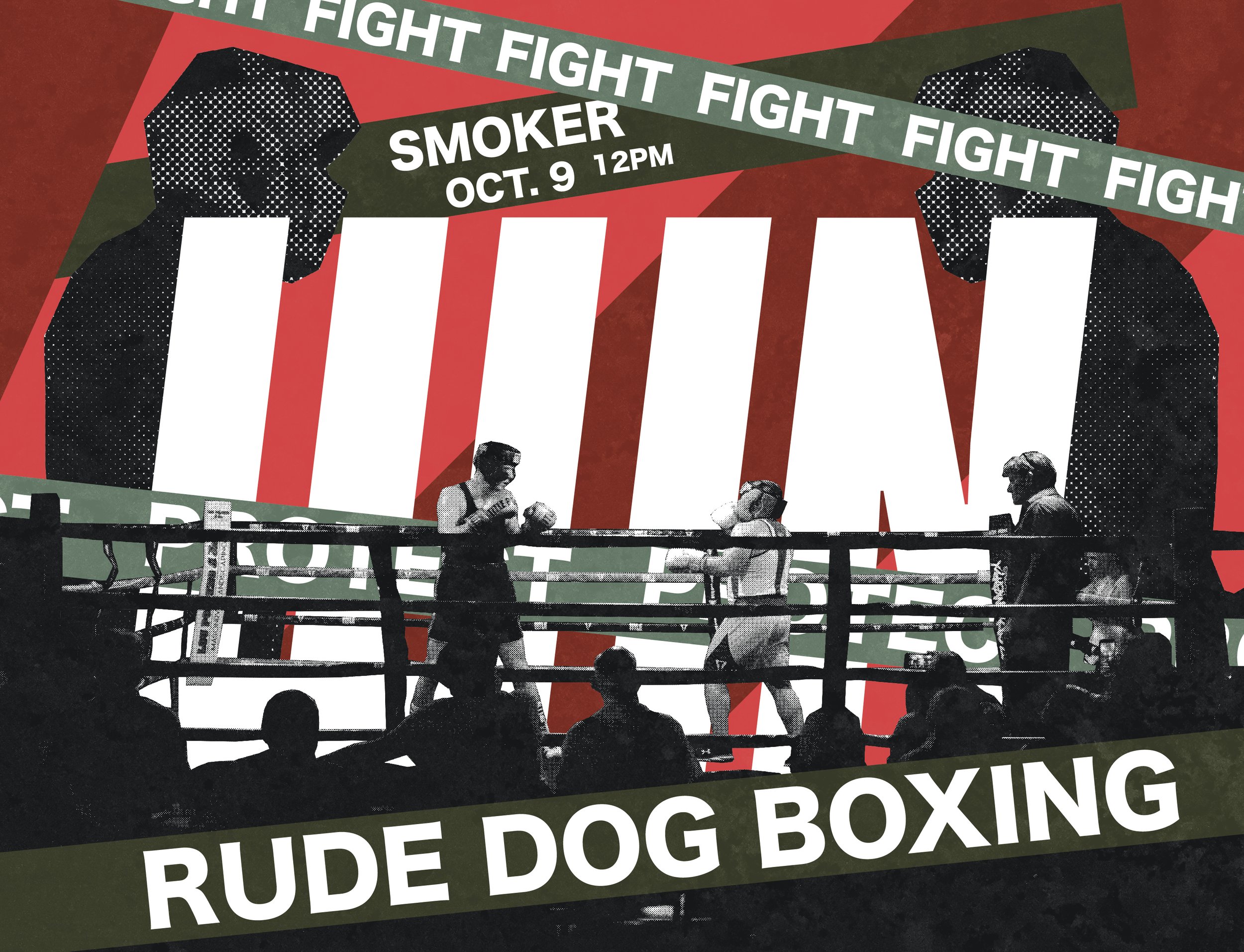
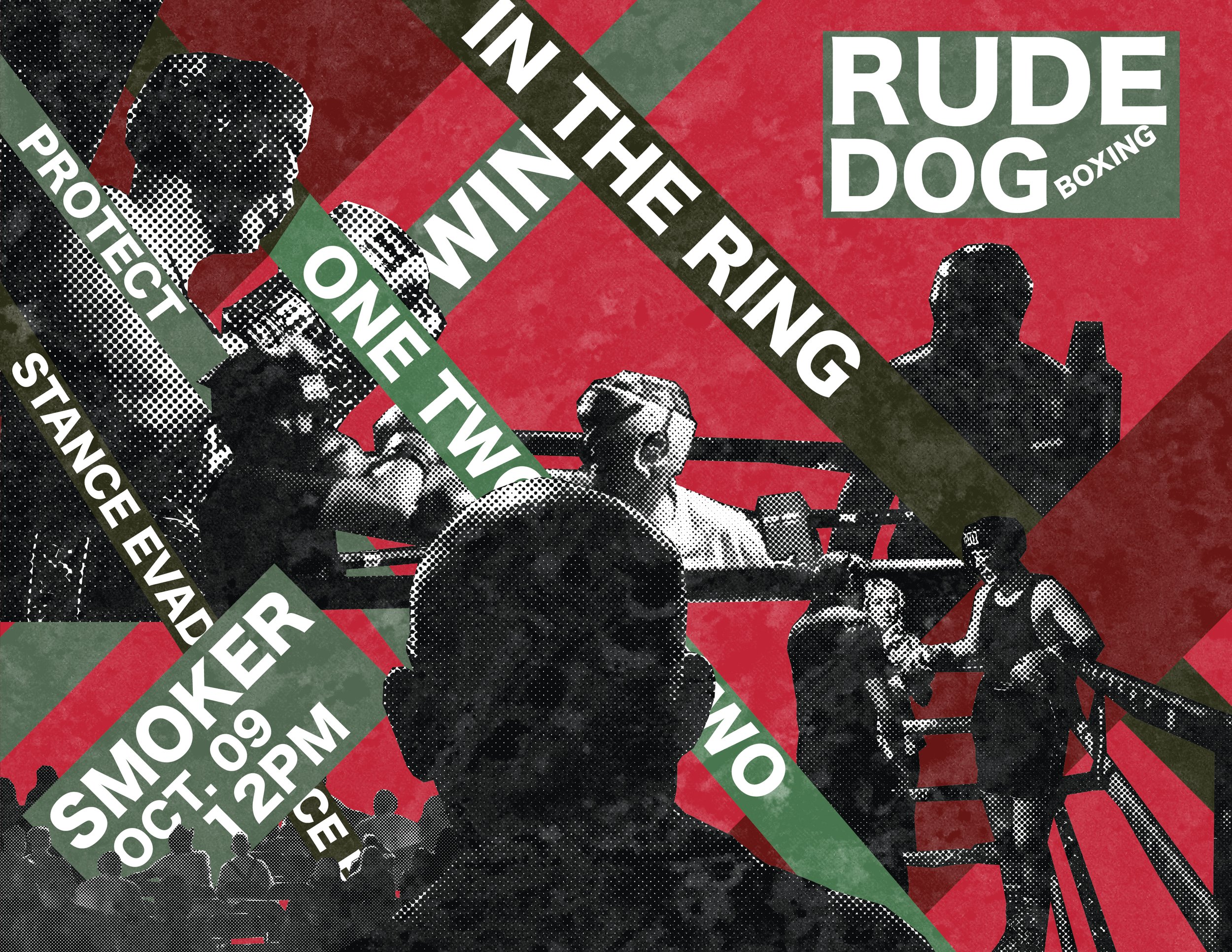
Rude Dog Boxing posters were heavily inspired by constructivist design. The many diagonals, halftone cutouts, repetitions, symmetry, san-serifs, and utilitarian aesthetic were effective in representing the toughness that boxing portrays. The project opted for a darker tone so the text would remain legible. The self-taken photographs were shot in bursts and trimmed into an animation that was aimed at expressing the emotion of boxing.


RUDE DOG BOXING
